Lately, I have been reviewing proposals and playing a game with myself called “Guess how many grants the PI already has based solely on flipping through the proposal to see the formatting.” The correlation is quite pronounced: people who have a reader-friendly layout are universally better funded than those who don’t. When you start reading, you also see that their text flows better (even if the ideas are not necessarily earth-shattering and they end up not funded). Successful grant writers definitely take care of readability, and readability includes thinking about the layout. Good, reader-friendly layout helps your reviewer think happy thoughts and not dread reading on, as opposed to start hating you with a passion 2 pages in because the gray walls of text gave him/her a claustrophobia attack.
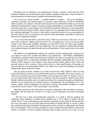
These tips have been mentioned online many times, I am sure, but they never get old: for goodness’ sake, put some space between paragraphs, go with spacing that’s greater than single (1.1 to 1.2), and break up the text. Ideally, each page will have a figure, a table, or at the very least one or two displayed (as opposed to inline) equations. Look at these three samples — the text from my earlier post, “Musings on Networking” — which format seems the least stifling and the most inviting?
All the text is in 11 pt Times New Roman. I am a Times New Roman fan, it’s a classic font and you will never go wrong with it. There are people who like sans serif fonts like Helvetica or Arial, which are just not my cup of tea. But if a funding agency says a font is fine, then it’s fine; have fun with it. Also, I know people will say “But I am constrained to 15 (or however many) pages, I can’t waste space on silly tricks.” Yes, you can and you should. You can purge the fluff and become even more clear and succinct than before, and the reviewer will be happier for it in more ways than one.
— Do give your proposal a title that is short and catchy, but please also be accurate. I got several proposals roughly entitled “Pie in the Sky Is High But I Can Fly” and then one is about the aeronautical engineering of taking off, another is about optimizing sugar-to-flour ratio in pie recipes, and the third is about why the sky is blue and if we can manipulate its color.
— There are always fads, hot areas. Once a topic is established as hot, money gets thrown at it, and many people move into the field. However, big groups move faster, and if there are low-hanging fruits, they will be picked by the most nimble. If you are a junior faculty who is just starting with 2 students, you will not be beating a big-named guy who has invented the field, has multimillion-dollar centers funding him to do the work already, and has an army of minions going after the easy pickings. At best, you’ll be just another “me too.” At worst, you will never get any money to do what you are proposing, because groups much bigger and much farther along than you proposed and got funded to do that same exact thing last year and the year before.
When you are just starting up, be mindful of what your strengths are and how fast you can conceivably do something. If you are phenomenally successful at getting money and able to grow much faster than an average new prof, then sure, go ahead, toe to toe with the big guys. But if you are not, then you need to find a niche, something you can do better than others, because of your expertise or how you approach the problems or because no one figured out that some specific aspect may be both important and doable, something that is uniquely yours, not just an obvious question within the latest flavor-of-the-week topic. Be realistic about what you can pull off with the money and personnel you have. And when you identify your niche, then jump on it with all you’ve got.
— I laughed out loud in my office at a sentence that said something like “In year n of the project, the results will be published in a journal of impact factor at least 10.”
AHAHAHAHAHA! Only 10? Why so low? The stuff is guaranteed to get into Nature! Seriously, people. That’s just amateurish. I can forgive when a graduate student lists 10 papers “in preparation” or “to be submitted to Nature Progeny” on their CV, but a grownup scientist should know better. You can tell me you expect high-impact stuff, but better yet write your proposal in such a compelling fashion that it is crystal clear to me this will be high-impact stuff, in which case I will strongly advocate for funding you. In contrast, the silly silliness of “We’ll totally publish in a Super Duper Glam Mag” is just silly.
I like to use subheadings in proposals as well – another way to break up a block of text.
Oh, yes, absolutely! Subheadings are great.
What is your take on using a lot of subheading and figures but no para-space?
there is no point using both intend and extra space between paragraphs, one is enough to mark an end of a paragraph. Version 1 would actually be the best if the spacing between the lines was optimal, say 1.3-1.4 pt. There is a whole little science on how to set letters and texts together to make them as pleasantly readable as possible, called typography 😉 Just open any book you enjoyed reading and see how they do it.
Funny Researcher, these are just some thoughts. The best thing is to look at other people’s proposals and see how they do it. Basically, you should avoid huge walls of text that give you a cramped feeling. I don’t think you need to throw all the tricks in there, just make sure the text is broken up a little and that each page something visually memorable on it.
Kamyk, I think most people writing proposals with a fixed page limit would get an aneurysm at the thought of 1.3-1.4x spacing between lines! 🙂 There is the limit to how much we can rely on the best typographic practices — it’s more of a balance between cramming stuff in and not pissing off a reviewer too much. Since everyone is actually used to seeing slightly cramped text, then your nicely typeset less dense treatise will look like maybe you don’t have enough to say — you might seriously get penalized for the text being too readable! People who submit to the NSF follow the NSF guidelines for spacing(“No more than six lines of text within a vertical space of one inch”), which for instance is the 11 pt TNR font w/ 1.1-1.15 spacing at the very dense limit.
I have actually seen quite a few proposals with a small spacing between paragraphs plus indents. In my opinion, if no indent, the spacing between paragraphs would have to be greater than 6 pt, which you may or may not want to do for space-saving reasons.
Anyway, as I said above, the broad “rules” as I see them are to break up the text and ideally try to make each page visually memorable. Go crazy! 🙂
thx xykademiqz! I have never thought about it actually… I am right now in the middle of writing dozens of proposals for postdoc grants and I’ve always thought a cramped page with 0.5 cm margins completely covered with texts and “important facts” pisses the reviewers off on the survival level of their brains, but maybe I’m wrong… I just have a particularly strong aversion to this special style that some silly people consider typically scientific – small font, unreadably long sentences, comic sans, stains on your t-shirts while you give the keynote address with yellow text on blue background slides… 😉 Thanks for the comment to the comment!
Being stubborn, I would still decrease the spacing between letters to 90-95% (and do it in InDesign, MS Word has no idea how to do it correctly…) and use the saved space to increase the light between the lines 🙂
… I would still decrease the spacing between letters to 90-95% (and do it in InDesign, MS Word has no idea how to do it correctly…) and use the saved space to increase the light between the lines
Oh yes, I forgot to mention, there are people (some very successful grant writers among them) who swear by left-aligned text for this reason, because they don’t like how commonly used software like Word deals with justified alignment. (I use Latex which does a very good job with spacing between letters if that’s what you want to tweak, but I’ve never fiddled with it.)
At the end of the day, you yourself need to think the proposal looks pretty and polished. If you don’t love it, nobody else will!
For spacing, after you finish go through and make sure that there are no one or two word lines at the ends of paragraphs, these are big space wasters. You basically get rid of them by changing a few words saving at least half a page in a 15 pager.
Also there are limits on kerning.
Eli FTW!
I just retired after 40 years working in RDT&E for the DoD, therefore writing, and later on reviewing many proposals.
How long are your proposals? And, how many proposals are the reviewer(s) going to have to read?
My number 1 rule: 2 column format. Unless of course there is some proposal format rule that rules that out.
The reason? After reading many 100-page props, the eyes get tired trying to follow that line of type line all the way across the page. Two column format is much easier, for at least this reviewer, to read. 🙂
2 column format is great if people print out the proposal. If they read it on the screen it just gets reviewers angry as they pump up and down the page. Yes, it looks beautiful and yes, short lines are great, but most of us just blow up the page to 125 or 150%. Agree on the 100 pagers which are pretty much gone. Praise the Lord!!
Reviewing military proposals, no one had a soft copy on any machine. all we had were hard copies which were tightly controlled. electrons have a bad habit of ending up where you don’t want them.
in Sweden you still send several printed out copies for some grants…
A couple of antiquated considerations that may yet be of some use:
When asked to send a fax copy — first, reprint it after changing the font so the letters don’t run together (as they do for example with MSWord’s default Times New Roman).
Courier is good.
And
Push the “Fine” or “high resolution” button as your fax goes out. That way, on the receiving end, they get a clean enough copy to hope for reasonable success with OCR, or to have what you sent retyped by someone who doesn’t recognize the words.
Printers spent 500 years figuring this readability stuff out, back when white space was expensive. Look at a century-old textbook or novel (the fact that you can is a testimony to the benefits of acid-free paper, but that’s another tangent). Small pages, tiny print, and far more legible than anything you’ll find online.
Lucida Fax is a better font choice than Courier for sending a fax. Of course, there is some question why anyone would be using an obsolete technology like fax.